 http://www.blogger.com/img/gl.link.gif
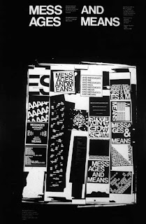
In a design industry still dominated by men one person stood out to break the cliche. Muriel Cooper. Her mitpress logo is for me one of the best logos ever designed. Taking 7 book spines and moving 1 upwards and 1 downwards is perfect in every way. But as always going beyond the printed world; it is a bar code that means zero as well.
Further work producing books by the designer was the start of what we now know as desktop publishing. Her 1994 work 'word landscapes' made me move into digital design. A decade on designers only started to realise this navigation through flash using action script.
She is a much looked over genius well before her time but approached design from workshop 'make it yourself' practice. As mentioned in the previous post David Reinfurt's article and work on her is a good start in showing the recognition Copper's work deserves.
David's MIT pages


No comments:
Post a Comment