Media Search

Custom Search
Media Search Results
Monday, April 30, 2007
Sunday, April 29, 2007
octavo magazine


 8vo
8vo octavo magazine 1986 / 92
Hamish Muir and Mark Holt founders
http://www.hamishmuir.com/
http://www.markholtdesign.com/hom.html
For those that missed it back in the day, Lars Muller has published 8vo on the outside.
Saturday, April 28, 2007
Feeding squirrels to the nuts

 This takes me back to Portsmouth Art College (I must be getting sentimental lately)
Cactus network had a off shoot project Squirrels by Tony Credland.
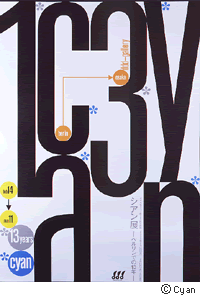
Contributors included work from Cyan (Berlin), Cloaca Maxima (Gent), Tat & Whimsey, Melisa Price, Cactus (London), Co-op design (Mainz), Coloured hard (New York), Ian Noble (Portsmouth) and Cactus (Munchen). With writing from Michele-Anne Dauppe and Teal Triggs. Ryan McGinness (NY),Grrr (Barcelona), Cactus (Munchen) Stamp (St Etienne), WD+RU, Karen Eliot, Graphic Thought Facility, Luther Blissett, Paul Anderson (London) Utopia (Paris), Marion Burbulla (Berlin). With writing from: Teal Triggs and Cees Hamelink. Andrea Kreuse, Jurgen Albrecht, Marion Delhees, Achim Wieland, Ola Giza, Sarah Mansell, Daniel Borck, Tony Credland, Filipa Pais Rodrigues, Zeina Maasri, Glenn Orton, Peter Bilak, Daan van der Velden and Matthew Shadbolt With writing by Jan van Toorn, Paul Elliman, Andrew Blauvelt, Jean Fisher, Sylvie Toux, John Bird, Cees Hamelink, Teal Triggs, Paul Newson, and Micheal Rock.
Ian Noble at the LCC designing with type projects
 Ian goes blonde and designing with type.
Teachers don't get better than Noble, a man who lives and breaves type design and research.
it seems he likes Helvetica Neue as his favourite font as well.
we interrupt the programme
http://www.f5-ksiegarnia.pl/nowy_podzial.asp?id=798&kat=16
Friday, April 27, 2007
Helvetica Neue Film


Ian Noble goes blonde. See previous post.
Talking of type heads
Helvetica the movie.
In my opion there is only one cut of Helvetica and that's Neue. 45/55/65/75
(85 is just pushing it too far and 35 is just Orange noddy.)
The opinons of Wim Crouwel and Neville Brody sum up the dilema.
Broady says that Helvetica is neutral in the way GAP is, safe, you know you won't offend anyone with it. My interpretation of this is bland. The font has been so over used in the wrong way and context that it's become the magnolia of fonts.
Crouwel seems to be pointing at the idea that it's almost the only font to be used as it's neutrality makes it remain the quiet element in the design. It leaves the design to be the message and you can ignore the font. I agree that fonts are so badly used by designers, it's currency has become cheaper and easier to use. The craft of typography has all but vanished from most agencies /practices. Even to the point where clients somtimes decide on fonts to use, they have forgot what fonts were invented for, serif easier to read in smaller columns easier on the eye as you read. Gothic condensed to squeeze more words in the coloumns, sans serif for headlines for clarity.
I'd like to see the sequel to this film, room 101 of fonts. First in line would be Arial, Optima and Chicago I could go on but why bother. I love neue as much as the next designer but to only design with one font is like eating porridge ever day, good for you, neutral and long lasting but ultimately like the GAP a bit bland when over used.
Bring back classic modern favourites like Univers, Zurich and Berthold Akzidenz as well. Dust them off and and kern the buggers as these fonts won't set themselves.
Audio Collective
 One Word
TODO was contacted to design a system to sample and display audience's collective voice during the events.the interactive system ONEWORD is a social display of crowd moods and feelings during an event: people send SMS to a special number and the messages are then displayed with a tree-like generative graphic software. As soon as a new message arrives a new branch blossoms.
Thursday, April 26, 2007
Big Rocket Yellow Pages Campaign
Sunday, April 15, 2007
The Wire

One of the best TV dramas along side Sopranos.
Written by a team in Baltimore; reporter, detective and crime author
Edward Burns writer and Ex Prod David Simons.
Apart from a very few cheesy moments with McNulty and his police buddies 'hey the teams back together!High 5' (yeah sure, more like 'not your ugly mug again, shit for brains!') this TV is fucking amazing. Each season plays out over 12, 1hr episodes. Particularly amazing and low key performances by Barksdale, Stringer Bell and Stinkum. Amazing detailing and real languid filming of scenes, sometimes just a junkie fixing up or containers coming off a ship. If this is TV without the Network it's good. A rare glimse of a TV company focusing on the creative rather than the reach of audience, HBO do it again.
Friday, April 13, 2007
Thursday, April 05, 2007
Subscribe to:
Comments (Atom)


